PulseKit
A clean, structured HTML5 landing page template for SaaS, analytics and developer-tool products.
About this theme
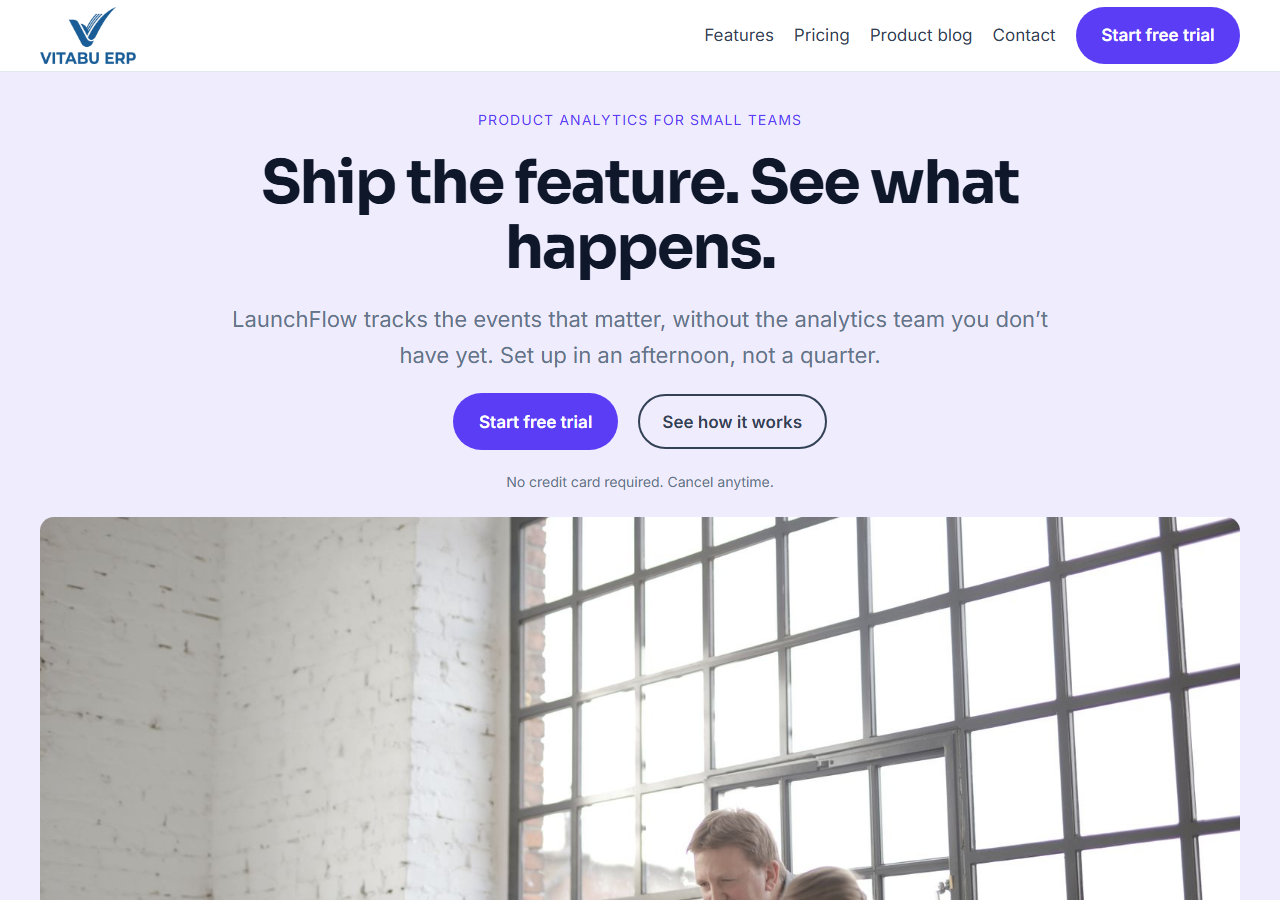
PulseKit is a full landing page template built for SaaS and analytics products. It includes a hero section with a dashboard mockup, a logo strip, an interactive product tab section (switch between live views with real JavaScript, not just screenshots), a numbered feature grid, an animated stats band, an integrations grid, testimonials, a 3-tier pricing table with a working monthly/annual billing toggle, an FAQ accordion, and a footer with newsletter signup. Built with plain HTML, CSS and vanilla JavaScript — no build step, no framework dependency. Fully responsive, with a built-in dark mode toggle (persisted per visitor) and smooth scroll-reveal animations. Deliberately restrained visual language — one brand color, no gradients, no decorative icon sets — so it reads as a serious product site, not a generic template, and restyles cleanly to match your own brand by editing a handful of CSS custom properties.
Platform compatibility
| Edition | Responsive | RTL | Translation-ready | Dark mode | Version |
|---|---|---|---|---|---|
| HTML5 | ✓ | — | — | ✓ | 1.0.0 |
Documentation
Getting started
1. Unzip the downloaded package. 2. Open index.html directly in a browser to preview it, or upload the whole folder to your web host. 3. All styling lives in assets/css/styles.css — the brand color, borders and spacing are controlled by the CSS custom properties (variables) at the top of the file. Change --c-primary to restyle the whole site to your brand. 4. All interactivity — the mobile menu, dark mode toggle, product tabs, the pricing billing toggle, and scroll animations — lives in assets/js/main.js, plain vanilla JavaScript with no dependencies or build step. 5. Replace the placeholder copy, customer names and pricing in index.html with your own content. 6. The contact and newsletter forms are UI-only by default — wire the form action up to your own backend or a form service to receive submissions.
Editing the product tabs and pricing toggle
The Product section's four tabs are plain markup, not a component: each button in .tab-buttons has a data-tab attribute matching a .tab-panel's data-panel attribute in .tab-panels, and main.js just toggles an is-active class on click — add, remove or rename a tab by editing both the button and its matching panel, no JavaScript changes required. The pricing billing toggle works the same way: each .price-amount element carries data-monthly and data-annual attributes, and main.js swaps the displayed text between them when the switch is clicked. Update those two attributes per plan to change the prices shown in each billing mode.
Reviews
No reviews yet — be the first to share your experience.
Related themes